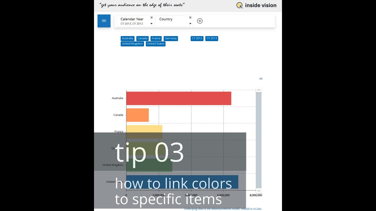
 Have you ever tried to use colors for specific items in a chart, to assist end-users in easy-to-understand dashboards? It can be a pain-staking exercise if not done correctly. This video will show you how to attach specific colors to items displayed, in the correct way, so your audience will learn that when they see a certain color, the underlying item is referenced.
 imeline and topics:
- Notice that in the end-result, the colors are fixed: Australia = red, Canada = orange, France = Yellow, … etc.
- In the first attempt; by applying a palette to the “Color Mode” of the chart, you seem to get the desired result;
- but when you deselect Australia in the filter, all the colors shift, so Canada gets the red color. This is wrong;
- you can change this by fixing the colors to items;
- first, add a new measure in the underlying data, being the country name;
- then, in the “Color Mode” assign a conditional color assignment, so each country gets a fixed color;
- now, when you change the filters, you will see that each country still keeps its own assigned color;
- same when you change the global filters.
More on www.inside-vision.com/dashboard-tips


0 Comments